by Chris Harris
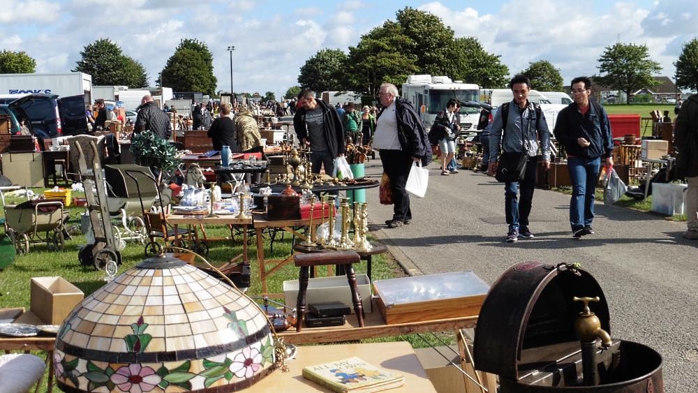
Buying prints at antique fairs can be brilliant, but it can also be frustratingly confusing. Over more years than I care to remember, I’ve learned that most of the mistakes people make come from not knowing what to avoid, you have learned the ‘knowledge.’ Most vintage buying is instinctive, but like porcelain maker’s marks, prints have their marks, and therefore once you get a gist of how it works, it can be quite simple to quickly identify good and bad, without taking a phone out, taking a photo and asking Google!
There are simple patterns, and once you know them, you start spotting the traps straight away. Here are the red flags I look out for whenever I’m browsing the eclectic wares at a fair or even auction.
1. A Printed Signature Instead of a Real One
A real signature is almost always done in pencil in the margin. When the signature is part of the printing itself, the same tone, same ink, same texture, that’s a poster or open edition reproduction. It might look nice on the wall, but it will never hold real value. If the seller pretends it’s “just as good,” just walk away. Remember, it must look like somebody has just written it by hand, not something from a book.
2 “Limited Edition” Without a Number
If a dealer tells you it’s a limited edition but there’s no number written on the print, it probably isn’t. True limited editions are numbered like 23/75. Anything else is marketing language. Those pieces were often churned out in their thousands and sold in homewares shops, you’ve found something that would have sold in an equivalent of Ikea.
3. Editions That Are Far Too Large
The moment I see an edition size of 500, 750 or worse, I know exactly what I’m looking at: mass-produced decorator art. Even if it’s signed, the value is limited because scarcity just isn’t there. Big editions dilute any chance of collectability.
4. Faded Colours Especially Blues
Certain colours fade dramatically in sunlight, and blues are the first to go. If the print looks washed out, cloudy or flat, that’s usually UV damage. Some buyers don’t mind it, but for collectors this is death. Fading is almost impossible to correct without replacing the artwork entirely. You often see these in dingy old hotels, generally from the 70s and 80s in thin brown frames with a gold line to the aperture to add a touch of class, but just look cheap.
5. Foxing or Mould on the Paper
Those small brown spots that look like freckles are foxing. They spread. They get worse. Once a print has heavy foxing, restoration becomes expensive and, unless rare or highly collectable, is not worthwhile. If I see foxing inside the mount or creeping across the margin, I put the print down.
6. Cheap or Abusive Framing
Frames tell you a lot about how something has been treated. If the mount is yellow, the backing board is brown and brittle, or the tape holding the artwork in place looks like it came from a parcel depot, it’s a sign the print has been “cooked” over time. Acidic materials damage paper. A good print trapped in a bad frame can die slowly. Always look at the backing, if it presents well it is good quality, if it cheap card a slight upgrade on Sellotape it is crap.
7. Dealers Who Can’t Tell You Anything About the Artist
If I ask, “Who is the artist?” and the seller shrugs or says, “Oh, he was very popular in the 80s,” I’m already losing interest. A print becomes valuable because of the artist’s career. If nobody knows who made it, or the only record of them is a few hits on old Pinterest boards, that’s not a good sign for long term value.
8. Overly Decorative Images with No Real Market
There is a difference between art and decoration. Some prints were never meant to be anything more than something nice to fill a hotel corridor. That’s fine, but those pieces won’t hold value. If you’ve seen variations of the same image a hundred times, cottages, generic florals, vague seascapes, you’re probably looking at mass market work and of no collectible value
9. Too Many “Artist Proofs”
Artist’s proofs (A/P) can be desirable, but if every other print on a stall is marked A/P, that’s suspicious. In proper printmaking there are only a handful of proofs. When there are dozens, it suggests the edition wasn’t controlled or the A/P label is being misused to make something seem rarer than it is.
10. Prices That Don’t Match the Reality
Sometimes you find a print by a known artist that’s priced sensibly. Other times you find a print by a complete unknown priced as if they’re on the brink of a Tate retrospective. When a seller can’t justify a high price with evidence, exhibition history, auction results, a solid provenance, it’s usually wishful thinking.
It is vital to consider the above: many people sell prints online, and many dealers use them as points of reference and for valuation. These prices flatter to deceive. You can see them online because they are still for sale, and nobody has bought them for a reason; they are overpriced.
Final Thought
The best advice I can give is simple: trust your eye, but verify everything else. Buy what you genuinely love, and don’t be fooled into thinking every limited edition is an investment. Some prints grow in value. Most don’t. But if you learn to recognise the warning signs, you’ll start finding the pieces that really are worth bringing home, both financially and aesthetically.
Remember, if in doubt, leave it.
#Vintage Prints #Buying Prints #Antique Fairs #Buying Pictures #Vintage Prints
